Melbet
The Secret of the Sands
An Egypt-themed promo where we skipped the generic motifs and built our own library of 3D elements: modelled, textured, lit and rendered for this campaign. Those renders became the backbone of the whole identity.
THE SECRET OF THE SANDS
The idea was set - a promotion themed around Ancient Egypt.
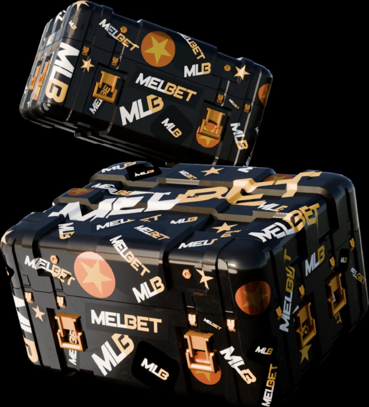
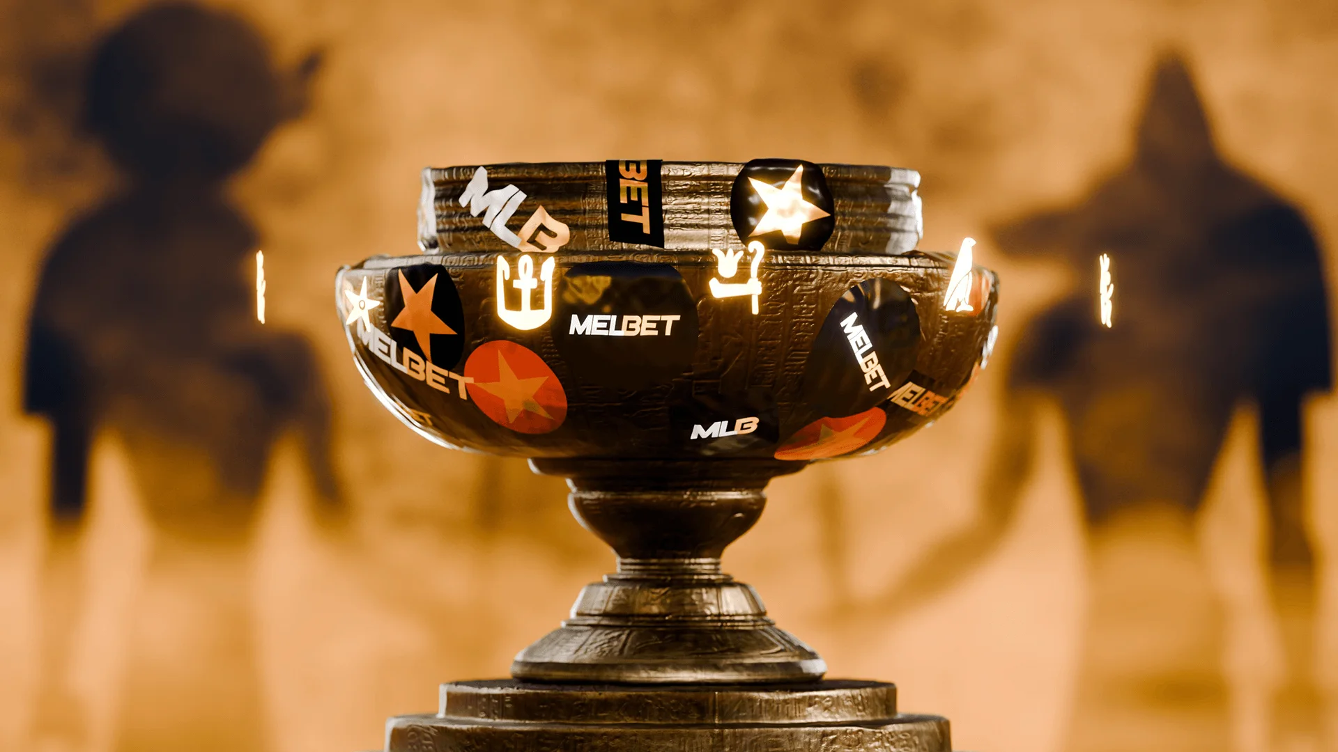
Our task was to turn that direction into a complete visual identity built from scratch. Instead of relying on existing assets or generic motifs, we created our own library of custom 3D elements - modeled, textured, lit, and rendered specifically for this project. These renders became the visual backbone of the entire promo, shaping the mood, the compositions, and the overall identity.
Ancient Egypt is visually rich by default, so the challenge was not to bring in gold, symbols, or ornaments - but to use them in a way that feels controlled rather than excessive. We embraced the gold accents, ornamental shapes, and motif-inspired patterns, but applied them with clear intention. The visuals needed to feel premium and thematic, not crowded.
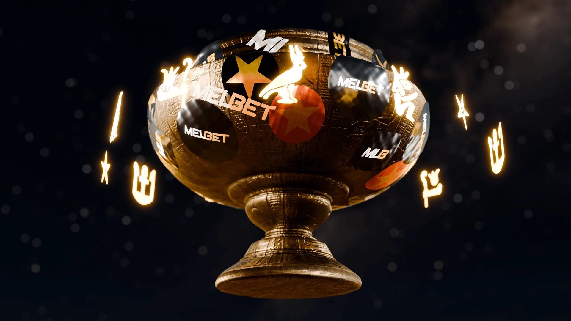
The foundation was the 3D work. We built a set of stylized artifacts and geometric decorative pieces, then textured them with a balanced mix of gold and stone materials. After rendering, these elements became the raw material for all the promo assets. This approach gave the project a unified visual language - every banner, frame, and graphic is connected through the same 3D world.
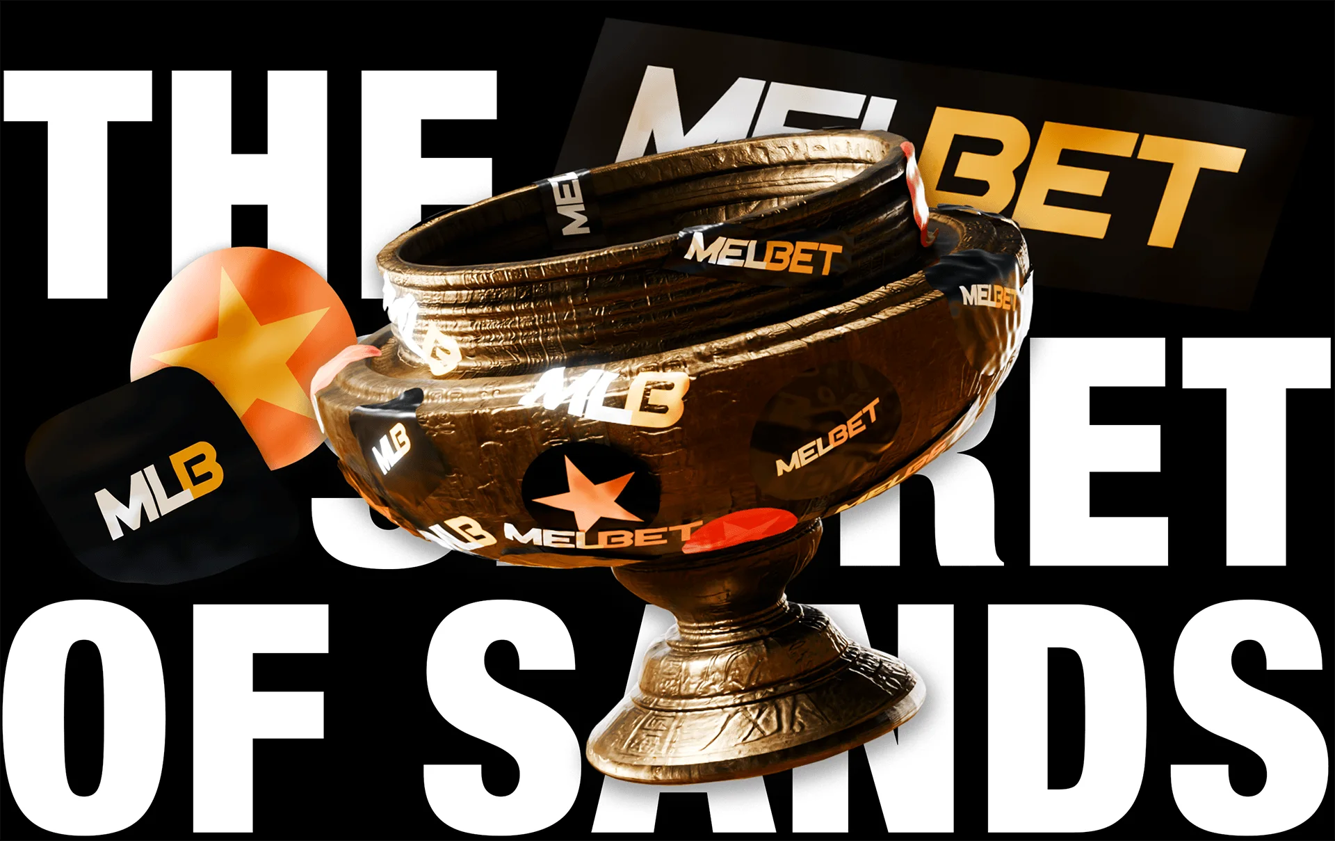
The banners were structured to hold up in multiple sizes without losing their identity.
When designing the banners, we used the renders to build compositions that immediately communicate the theme, but still support clean typography and readability.
Gold highlights, ornament fragments, and sand-toned gradients derived from the renders appear across the layouts, but always balanced with negative space.
The 3D animated video was based entirely on the assets we created. Since the models were custom, the animation style could stay consistent and controlled. We focused on sharp transitions, clean camera movement, and quick delivery of the theme.

The video uses reflections, light shifts, and compositions built around the 3D objects to introduce the promotion in a fast, polished way.
The landing page brought everything together, but with a different level of subtlety.
We did not use the 3D models themselves in the interface. Instead, we integrated the 3D renders into the layout as thematic accents - background depth, decorative elements, framing details, and subtle highlights.The structural design is intentionally clean: one idea per block, large typography, open spacing, and simple iconography. The theme supports the content rather than pulling attention away from it.
On the development side, we implemented the page from scratch and optimized all rendered assets for performance. The 3D images were exported with controlled weights, ornaments were simplified where necessary, and breakpoints were tuned manually. The result is a page that feels visually rich while staying fast and readable across devices.
When all components came together - the banners, the 3D animation, the landing page, and the underlying 3D render system - the promotion formed a cohesive, modern visual identity. The use of gold, ornaments, and Egyptian symbols feels deliberate rather than overwhelming, thanks to the shared 3D foundation that ties everything together.
Secret of Sands became a complete visual package shaped by the 3D renders we built specifically for this project. It is thematic without being loud, detailed without being overdone, and consistent from the first frame to the final scroll.